Ok, I'll try to keep all snarky comments about "cheating" out of this review. Because really, the Astros really have a VERY cool concept here for their City Connecti uniforms.
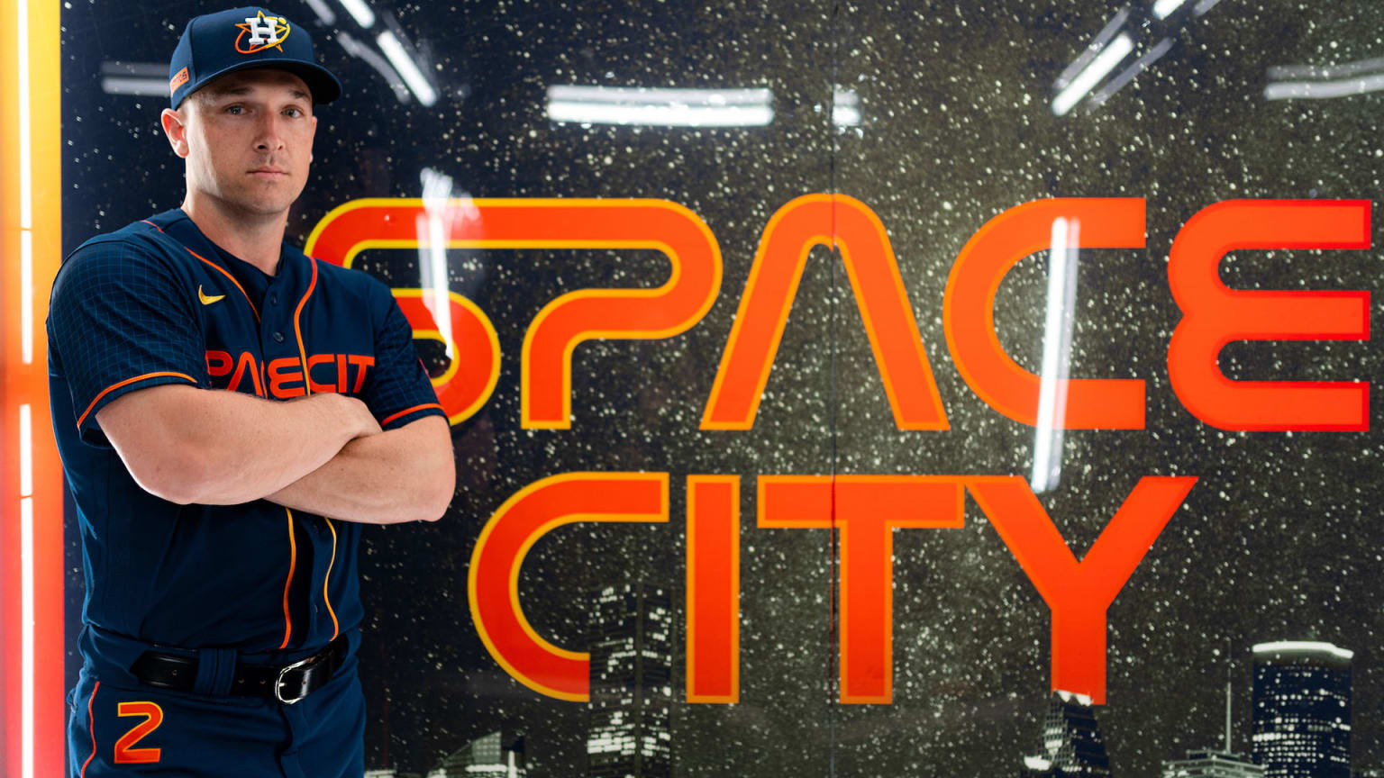
Houston and its ties to NASA and everything space exploration made this such an easy concept for Nike to move towards. I think what really makes this design so awesome is the ability to take the current color scheme and designs and turn it up a notch giving the Astros a very space-theme feel, but also, one that also comes off extremely futuristic.
There are several elements of this design that really work for me. The first is a minor element, but the biggest one is the gradient use of blue and orange throughout the uniform. From the piping on the front of the jerseys to the socks to the font on the back of the jerseys - and the minor tidbits in between - all of it is really well done.
Then there is the font which really brings the look together. It looks and feels as sci-fi and galactic as a space theme should.
And of course, there is the "Space City" moniker that obviously fits the vibe of the town. H-Town does as well (the Rockets currently use this), but it doesn't come across as cool in usage as it does in verbiage.


Nike has shown no hesitation to go one-color for top and pants, and in this design, they obviously flex that design concept again. I don't mind the all-blue look, especially as the gradient socks really remove the eyes away from what could be a very dark aesthetic presentation.
However, this may sound ridiculous, the number on the upper right leg is a HUGE eyesore for me. I'm not sure what is with baseball and this concept of having the jersey numbers on the pants (those vintage 70's White Sox uniforms are still a bother for me with this concept). I'm just not sure why it is needed. Again, I'm just not a fan of the pant numbers.
Overall, these are cool. I'm not in love with them as the designs for the White Sox, Nationals, and Diamondbacks, but these are good enough to pass. I love the color usage and the font, the whole package is just doable.