MLB CITY CONNECT SERIES - CHICAGO CUBS
The Chicago Cubs were the first team on the list named by Nike that I knew would test my overall love for the Nike Connect Series. For those of you jumping in on this post among the reviews of this series, I am a fan of the concept, I just simply worry about how to navigate altering the aesthetics and imagery of traditional organizations.
The Los Angeles Dodgers and the San Francisco Giants - those designs still to be unveiled and are next(!!) - will further push me on this.
Nonetheless, let's get to the Chicago Cubs uniforms, and quite frankly, my worry was proven right. I'm not a fan.


First, let's talk about the good stuff.
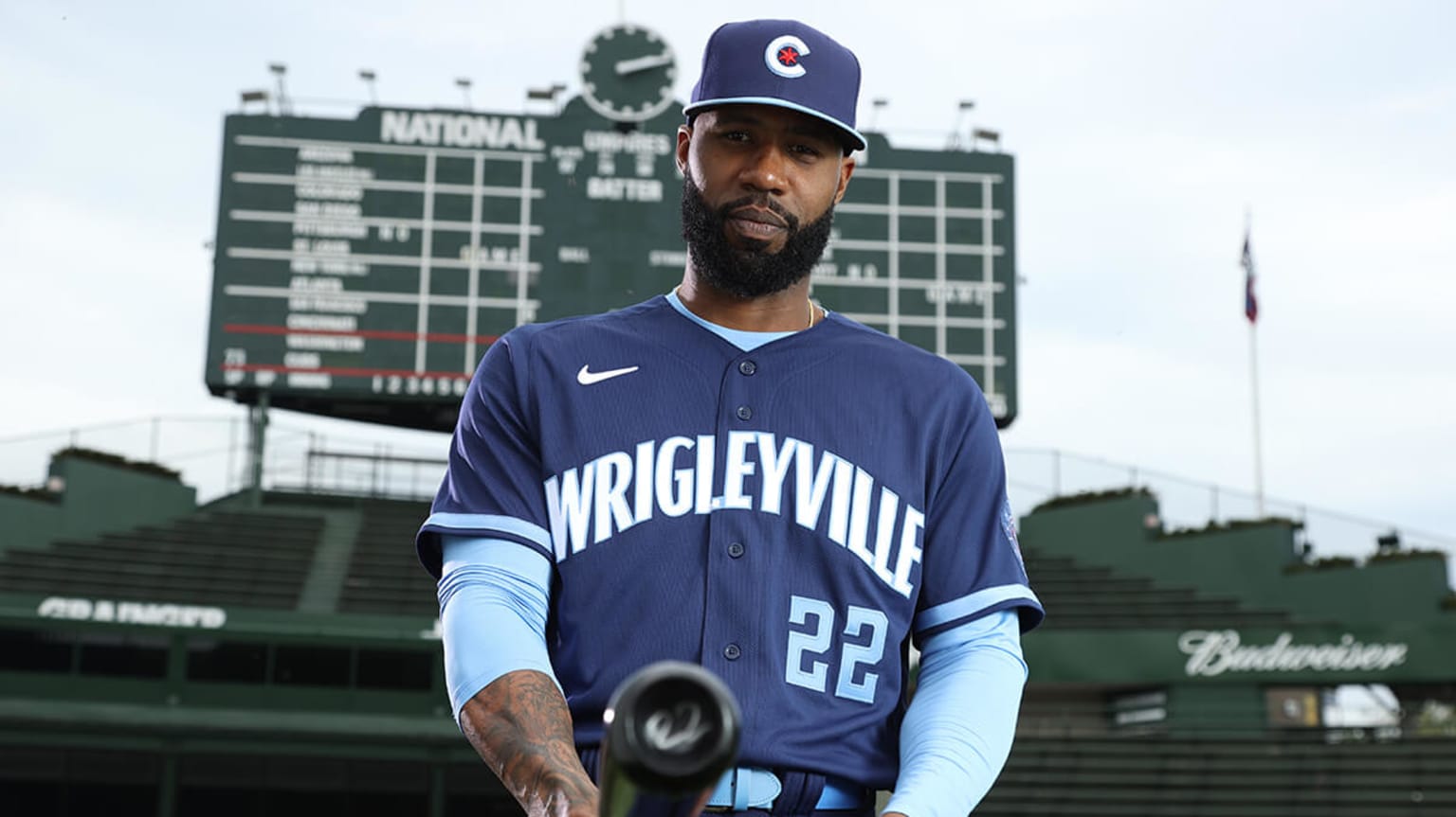
The color scheme is a cool blue that of course represents the city of Chicago. The palette is awesome. However, the city of Chicago has the coolest, and most recognizable city flag, in the country. Using this for the base design is easy and effective. Quite frankly - why wouldn't you use it? It screams Chi-town!!
The other cool aspect is "Wrigleyville" curved across the chest in the signature outfield design of Wrigley Field. That's a reallllllllly cool concept that jumps off the uniforms when you first lay your eyeballs on them.
With all of that said, while I'm not a fan of the overall look (more on that in a bit), I will say that this concept does sport the best overall cap design within the City Connect Series thus far. The famous Cubs "C" with the Chicago six-point star is so damn cool. It's the kind of design for a cap I can see becoming extremely popular not just for Cubs fans, but for Chicagoans looking to rep their city.
With all of that said, ironically, what makes these uniforms sort of cool, is why I'm just not into them.
As cool and as easy of a design it is to use the city flag, it's been done before. And in many cases, overdone. Nike has implemented the flag in the design of the Chicago Bulls city jerseys a couple of years ago, and those were absolutely amazing.

So while yes, the uniforms are cool, aesthetic, and perfectly acceptable - I still am not a fan of them.
What the heck?!?!
I know. I know.
For me, it's this simple - the organizations with significant aesthetics have to be special. They have to carry a similar look, and they have to be a superior alternative to the classic appeal. So yeah, it's a hard blend to generate and accomplish.
Going the route of the Chicago flag doesn't feel enough for me - especially for the Chicago Cubs. THE Chicago Cubs!
The uniforms just missed the beat of representing all 77 neighborhoods of Chicago by repping just one across the chest. The design ultimately feels like they tried too hard. And it makes it even worse that it is the first design for one of the many "traditional" franchises that many - like myself - were waiting to see how Nike walked that balance.
So yeah, this is a miss for me.
But...the hats are dope.
---
NIKE LEBRON 19


I still can't believe we're getting a Space Jam 2...
Nevertheless, while I wrestle with that cheesy reality, it's so smart of Nike to unveil the new LeBron 19s as the movie gears up for release this summer. After all, we all know Nike does NOTHING without hype or planning.
Of course, not only is there tons of pressure here all around now to match the cult-following that is the original Space Jam film but there is pressure on the sneaker game to come close to the cult classic that is the Jordan XI design worn by MJ in the original.
Who doesn't love a pair of 12s?
It's clear the design team went for something that was cartoons meet "out of this world" and everything about the shoe feels like that. Carrying the air max design which LeBrons have come to include in some form or fashion as of late, the shoe carries the Space Jam "stamp" that will identify this design in the history of the Lebrons series (ala MJ's Olympic models), while also giving the line a return to a big, bulky, high-tongue, and bombastic feel that we haven't seen in the line for a while.
This is especially the case in the "Space Jam" colorway that carries the colors of Warner Bros and Looney Tunes. I am intrigued by the other colorways yet to be unveiled.
I'm a fan and I think these will not only be cool aesthetically in the movie and on the court for LeBron gearing up with the 6 on the chest, but this also could become one of the few designs in the LeBron line that stretches into lifestyle fashion fandom.
*Photos courtesy of nike.com and sneakernews.com