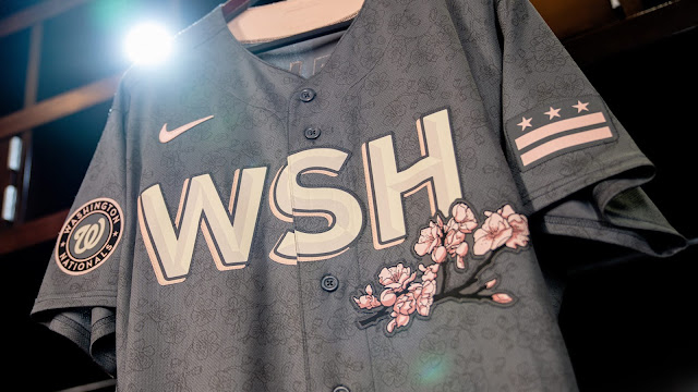
Nike returns for the 2022 MLB season for its second round of the MLB City Connect Series. Hopefully, this year, the shock of seeing your favorite team in some modern threads calms the classic don't-change-anything-ever fanbase that seems to engulf baseball. Despite the reaction, the Nationals lead off the 2022 campaign and it was definitely a great choice to go in this direction.
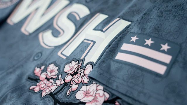
First, kudos to Nike for not going the lazy route of injecting some red, white, and blue design, or albeit, something patriotic-themed. Sometimes, when it comes to teams from the Capital, it's as if Washington D.C. has no other character but being the Nation's capital. Going with the Cherry Blossoms is not only enlightening but a really cool theme.
Pink isn't often used in color threads in sports. So to see the cherry blossoms represented by pink accompanied by the dark grey tone of the uniform is super unique and extremely exclusive. That subtle design of the flowers on the jerseys as a pattern again, so dope.
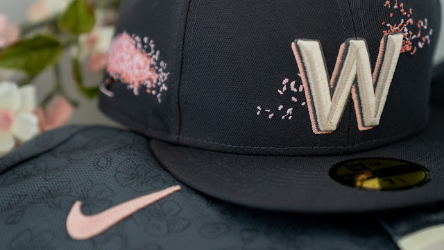
This might be a hot take, but the use of "WSH" might be one of the coolest and again, more unique, short-city names used in sports. "PHX" is probably unbeatable. However, I think the Wizards utilizing "District of Columbia" is so strange, that it is weird as well.The Senators-like "W" used on the hat is nice. The Nationals curly "W" has become synonymous in their continued branding of the relatively young organization, however, the nod here is welcomed and fits nicely.
All in all, this is one of my favorite collective designs yet. If not just for the design, for the sole purpose of its creation, exclusive feel (from the team's original design), and the depth of the look. I can also see these threads being a big hit for purchasing - something I don't think is the truth for all of these designs thus far.


