Look, I'm just going to jump right into this review of the Colorado Rockies City connect jerseys - I'm not a fan. The initial aesthetic at first can be jarring - in a good way - but after it settles in on your eyes (or at least mine), it quickly turns into, what the heck am I looking at. I'm trying to be fair, but overall, the look just carries supreme Sunday-softball-league vibes. Join our squad, we got awesome unis bro!
OK, I'm being over the top, but still...
There is so much to get into for my feelings, but the biggest is the overall theme for the jerseys which are derived from the Colorado state license plate - yes, you read that right. There is no question that Colorado has some dope license plates - after all, we've all done road trips and have somewhat ranked the aesthetics of state vehicle tags. However, carrying that over into jerseys? Is it that representative of the state?!
Now I get it, the team represents the entire state rather than a city as most teams do. And in doing so, they want to capture their base through this project. That's hard enough. However, I wouldn't have been mad if they went the easy route of the state flag - as Colorado has an absolutely awesome state flag. Too cliche? Maybe. At the very least, something historical that we may not be aware of? Mountains feel too easy, especially when the organization's name is in reference to that. Again, anything else. This license plate ordeal just ain't it for me.
However, what may just save this design are the hats. The City Connect series hasn't had many hats that win, and this one definitely is. I really do like the logo and the use of colors to go along with "Colorful Colorado". The green hat with the white facing is a good hat on its own. However, with the rest of the jersey? Again, yup, not feeling this.
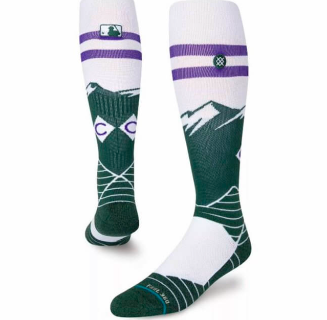
The socks are actually really cool. Whatevs.
Again, they tried on the license plate idea. It's unique, just not a fan of the end result.
Nike swung and missed on this one.


