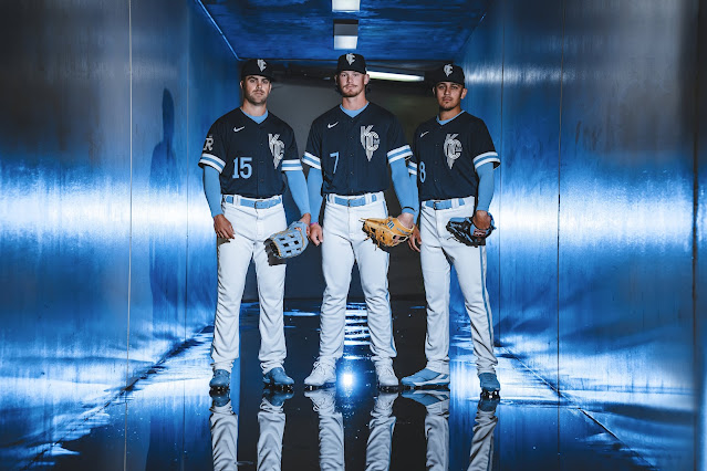
The Kansas City Royals' City Connect uniforms were a design that I wholeheartedly looked forward to. The Royals' current uniforms and aesthetics are some of the best in baseball, and for a city like Kansas City, it just feels like there was enough room creatively to do something historically enlightening (more so something many do not already know about the city), or a simple approach that builds off of the current design.
To be honest, it may sound simple, but the use of "blue" by the Royals is fantastic.
What we got is a concept that continued the awesome blue approach, with a design concept that is just as cool as their everyday threads. However, where I feel disappointed is the safe approach to this. I would have loved to see them lean into the rich history of the Negro Leagues that is Kansas City - a team (and city) able to do so more than others. That could have been really cool, enriching, meaningful, and somewhat different from the norm - maybe even an ode to the Monarchs? Nonetheless, we got the city of fountains theme through the blue lens - again, still VERY cool.
- At first glance, the entire look feels like a college baseball concept. That might sound bad, negative, or low-brow, but it's not meant to be. The wide stripes on the arm sleeves lend to this look, but doesn't take away from them.
- The "KC" within the city of fountains concept is such a cool design. The logo on the jerseys are cool, but I'm not so sure how they work on the hats. The logo comes across as just a bit too big. But maybe that's just me.
- One of the more interesting notes about the jerseys is the different color for the name font as opposed to the numbers. On the front, the numbers are on the lower right stomach and are in light blue, but on the back, the numbers are white, with the names remaining in blue. I don't hate it. I don't love it. I just find it merely interesting.
However, I do love the font concept. Especially the larger than usual nameplate.
Overall, the look isn't all that dynamic as it is just the jersey and the hats, and not a full body change like we've seen with some other designs. The overall jerseys and the awesome blue combination still drive the look. While it's a good design, it's a rarity thus far in this collection that this look is underwhelming to the already-alternative aesthetic designs of the teams.
These are just NOT better than the powder blue threads. Sorry, just my opinion. Nonetheless, these are still more than okay, and Nike certainly added to the overall presentation of the Kansas City Royals.


