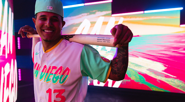
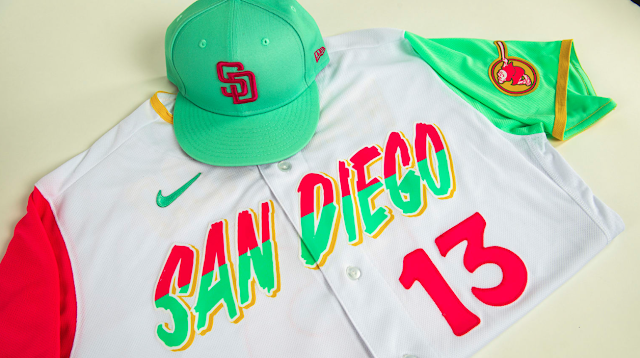
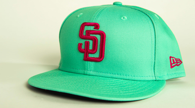
When I saw these threads, I immediately fell for them. They nailed it! These are dope!
San Diego was one of those teams that I pinpointed as the opportunity to be something special because of everything they encompass and represent, as well as the few ties to tradition that Nike would have to incorporate (a big hurdle in these designs, for sure) - Nike didn't disappoint here.
As you can imagine, I'm a fan.
Why? The main reason is that the design elicits a vibe for the city and the fanbase, which is the ultimate goal of these design concepts. The bright colors carry exclusive vibes of San Diego's culture, pays homage to its Mexican fanbase, and carries a font and typography that is distinctly unique within the overall aesthetics of the San Diego Padres presentation.
I get big-time similarities to the uniforms of the Miami Marlins and their Cuban influence, and how those threads were able to connect the culture and diversity of the fanbase.
"Two cities, two cultures, one home team" is the mantra stated by Manny Machado in the unveiling video. Everything about this design captures that.
Most of the designs thus far have had really bold statements across the chest line, which has been attractive to me. Yet, in this design, it is the combination colors of mint and pink which grab the attention and sets the tone. This is definitely the case on the jersey sleeves, which also give you vibes of the Mexican flag, without, you know, actually being too direct in its presentation. Brilliant. Again, a perfect blend of two cultures where both sides see themselves in the design.
The hat is also fire, which has been a lacking concept in all of the designs thus far. With only a few hats that work with the overall presentation and can work independently, the mint and pink with the interlocking SD meet that criteria.
Again, I love these. Such a vibe. Such a cool concept.


