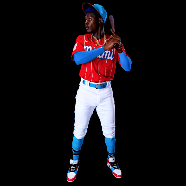
Obviously, the franchise has its share of identity chapters, with the most success coming under those black and teal threads that bore pinstripes and captured two World Series Championships. Isn't it still weird to think that the Marlins have not one, but TWO, titles?
Nonetheless, Nike selecting Derek Jeter's Miami Marlins for inclusion in its Nike MLB City Connect just seemed so organic, I would be surprised if the idea didn't just begin with a framework for this opportunity. And with that said, I think they crushed it.
Yes, even more so than the Boston Red Sox edition.
I absolutely love these. Nike decided to pick up the historic tradition of the Cuban Sugar Kings from the 1950s a team that long desired to become a Major League ballclub. Again, the Marlins are running with their Miami roots, and are slowly becoming the Caribbean's team as well. It also helps that the budding face of your franchise is Jazz Chisolm - pride of the Bahamas.
At an immediate glance, these are fire. The stark red and broad pinstripes instantly scream Cuba (as intended). Nike also did a tremendous job of the font across the chest sprawling "Miami" that carries a Havana-like feel - again, intended by Nike.
The nice ode to the history is with the "Sugar Kings" being place on the sleeve patch.
My greatest love for these threads is the simple throwback style of wacky and bold uniforms that are historically littered throughout baseball - beyond MLB. From the Negro Leagues to the various ball clubs in Latin America, and a few select in Japan, bright colors, bombastic lettering, and overall, a big character feel have somehow disappeared for sleeker smaller fonts, gradient designs, and simple overall lettered logo approaches.
These Miami threads return baseball to some of its roots, while also giving Miami a loud, bright, vibrant approach that represents everything they are - Miami, the Caribbean, and Latin America.
Also, they place a LOT of pressure on the Marlins to up their cleat game. These threads work beautifully as they could allow for some low-top darkened cleats to provide a REAL old-school approach (with high socks or stirrups of course), or, the opportunity to bring some fire shoe game to the table. Jordan 1s, anyone?
According to Nike, the uniforms are here to stay for several seasons.
My biggest concern with this line when it was announced was that it would take away from the identity of teams - especially those with strong established brands.
The Boston Red Sox ode to the Boston Marathon was nice, and a true test of my feelings right away. However, these Miami threads not only are better than the Boston uniforms, I think they ADD to what Miami is trying to establish and will surely play a role in how the franchise continues to rebrands going forward.
Very nice job. Love em'.
*Photos courtesy of NIKE.com and MLB.com


